Every chart drawn in this format, newest first. How it reads: Methodology.
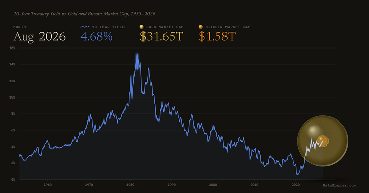
The 10-year Treasury yield as a line, gold's market cap as a sphere with bitcoin's inside it. Monthly since 1953.