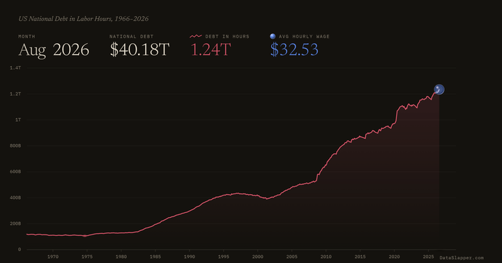
Every chart drawn in this format, newest first. How it reads: Methodology.
The national debt in hours of work as a line, the average hourly wage as a sphere. Monthly since 1966.